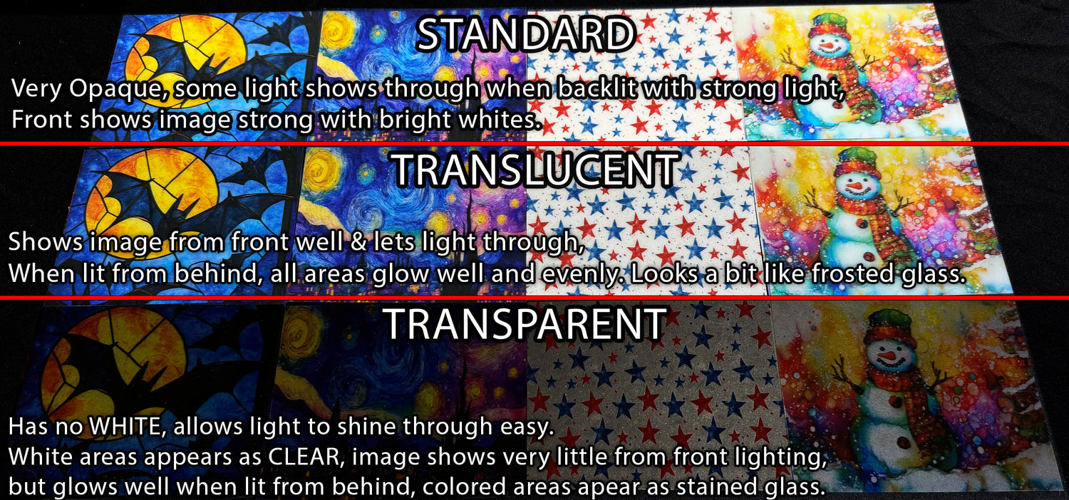
The Mystery of Opacity
This should clear up the slight mystery of what to choose when ordering a sheet for a specific project. This only applies to clear material as it has a lot to do with the way the light reacts to it. In this post you will see various examples that should make your choice easy, but keep in mind it may depend on the design choice as well, particularly when the design has a lot of white in the image.
-

STANDARD
When Standard Opacity is chosen, the image is very opaque yet does pass a slight glow of light when a very strong light is behind it. This is the best choice when the material is to be viewed from one side at a time and NOT good for light transmission through it. The best advantage is that the colors POP and the white is pure and clean. Below are a few examples of how some of the opacity acts to light and their uses.
-

TRANSLUCENT
When Translucent is chosen, the image is much like a frosted glass and transmits light in a very pleasing manner, great for suncatchers, backlit signs and such. This can also be used for nightlights as it gives a nice look to the diffusion of light and adds a thin white layer so that the WHITE is not CLEAR and gives a nice look from both sides.
-

TRANSPARENT
When a Transparent is chosen, the image acts much like stained glass; however, it is important to note that anything in the design that was previously WHITE will be CLEAR as it holds no color value... The Image is suited well for night lights as it responds well to light transmission and gives a nice glow, however this may not be desired as it may show the bulb behind it without a diffusion layer. If that is not desired a TRANSLUCENT is a good choice as it offers a mild diffusion and still allows light through.


Opacity from the front side
This shows how the various opacity shows from the front, the reflected light rather than the light through the sheet... Standard is always bright and shows all the image well, Translucent is a mix, and Transparent shows little reflected light, but great for backlighting.
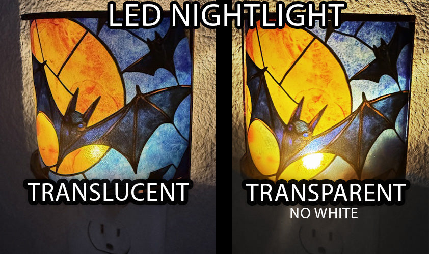
Translucent VS Transparent
In this example, we have a design that does not use white as a primary design, so it is full of color... this shows how the light bulb in the back can be seen slightly in Transparent, where the Translucent diffuses the light a bit to even out the colors. Either can be used and it is really a matter of preference.
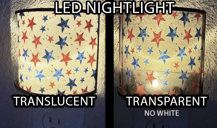
When white is a large part of the design
In this example, white was a large part of the design, so as seen here... in the Transparent the bulb in the nightlight is clearly visible, which may or may not be what you are looking for. The Translucent has an even image and does not need further diffusion.